
| 일 | 월 | 화 | 수 | 목 | 금 | 토 |
|---|---|---|---|---|---|---|
| 1 | 2 | 3 | 4 | 5 | 6 | |
| 7 | 8 | 9 | 10 | 11 | 12 | 13 |
| 14 | 15 | 16 | 17 | 18 | 19 | 20 |
| 21 | 22 | 23 | 24 | 25 | 26 | 27 |
| 28 | 29 | 30 | 31 |
Tags
- EC2 HTTP 호스팅
- Linux cat
- Linux apt
- Linux ls
- Linux 파일 관리 명령어
- Navigation Pattern
- Linux apt-get
- Linux oh my zsh
- Linux mkdir
- Linux 디렉터리 명령어
- EC2 zsh
- arbitrum sepolia eth
- Logback
- AWS EC2 서버 만들기
- 아비트럼 새폴리아 이더 받는법
- ec2 ssh unprotected private key file
- EC2 Apache2
- EC2 oh my zsh
- HTTP Web Server
- Linux cd
- 서버의 서비스 방식
- Linux pwd
- UNPROTECTED PRIVATE KEY FILE
- Linux rmdir
- Linux 디렉터리 역할
- linux background
- javascript scope
- javascript 정렬
- linux foreground
- Linux 디렉터리 구조
Archives
- Today
- Total
HyunJun 기술 블로그
CSS position 본문
728x90
반응형
1. CSS position
css 포지션이란 말 그대로 어떠한 기준에 맞춰 요소들을 position 할 것인지 지정하는 속성이다.
1) static
- CSS position의 기본값이다.
- static인 요소는 HTML 문서 상에서 원래 있어야 하는 위치에 배치하는 설정으로 다른 태그와의 관계에 의해 자동으로 배치된다.
- top, left, bottom,. right 값을 무시하게 되며, 임의의 위치 설정이 불가능하다.
<html lang="en">
  <head>
    <meta charset="UTF-8" />
    <meta name="viewport" content="width=device-width, initial-scale=1.0" />
    <title>Document</title>

    <style>
      .box {
        width: 100px;
        height: 100px;
        background-color: bisque;
        left: 200px;
      }

      .box:nth-child(2n) {
        background-color: azure;
      }
    </style>
  </head>
  <body>
    <div class="wrap">
      <div class="box">static</div>
      <div class="box">static</div>
      <div class="box">static</div>
    </div>
  </body>
</html>
2) relative
- 요소를 원래 위치에서 벗어나 임의의 위치를 지정할 수 있게 해준다.
- 요소를 기존의 원래 위치(static 일 때의 위치)를 기준으로 상대적(relative)으로 배치한다.
<html lang="en">
  <head>
    <meta charset="UTF-8" />
    <meta name="viewport" content="width=device-width, initial-scale=1.0" />
    <title>Document</title>

    <style>
      .box {
        width: 100px;
        height: 100px;
        background-color: bisque;
      }

      .box:nth-child(2n) {
        background-color: azure;
        position: relative;
        left: 100px;
      }
    </style>
  </head>
  <body>
    <div class="wrap">
      <div class="box">static</div>
      <div class="box">relative</div>
      <div class="box">static</div>
      <div class="box">relative</div>
    </div>
  </body>
</html>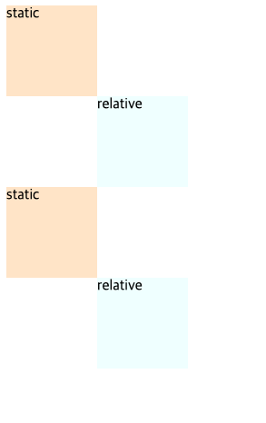
3) absolute
- 배치 기준을 부모 요소에서 찾는다.
- 부모 요소의 position 속성이 기본값인 static이 아닌 첫 번째 부모 요소를 기준으로 배치 기준을 잡는다.
- 부모 요소가 static인 경우 그다음 부모 요소로 타고 올라간다.
- 부모의 요소를 타고 가다가 부모 요소가 전부 static이라면, 가장 상위 부모인 body 요소가 배치 기준이 된다.
- 대부분의 경우 부모 요소(가장 가까운 상위 요소)를 기준으로 top, left, bottom, right 속성을 적용하므로 부모 요소의 속성을 relative로 지정해 주는 게 관례이다.
- absolute로서의 가장 큰 특징은 HTML 문서상에서 독립되어 앞뒤에 나온 요소와 상호작용을 하지 않는다.
<html lang="en">
  <head>
    <meta charset="UTF-8" />
    <meta name="viewport" content="width=device-width, initial-scale=1.0" />
    <title>Document</title>

    <style>
      .wrap {
        position: relative;
      }
      .box {
        width: 100px;
        height: 100px;
        background-color: bisque;
      }

      .box:nth-child(1) {
        background-color: azure;
        position: absolute;
        left: 100px;
      }

      .box:nth-child(2) {
        background-color: azure;
        position: absolute;
        left: 100px;
        top: 100px;
      }
    </style>
  </head>
  <body>
    <div class="wrap">
      <div class="box">absolute</div>
      <div class="box">absolute</div>
      <div class="box">static</div>
      <div class="box">static</div>
    </div>
  </body>
</html>
결과를 확인해 보면
- class가 wrap인 요소가 relative이므로, 해당 div를 기준으로 배치하게 되어, absolut box들이 해당 left와 top에 맞게 위치한다.
- absolute div들이 absolute position이기 때문에 독립적인 요소로 취급되어, static 요소들이 해당 요소들을 볼 수 없어 왼쪽 첫 줄을 차지하게 된다.

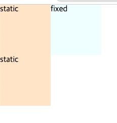
4) fixed
- 무조건 화면의 좌측 최상단을 기준으로 좌표를 고정한다. (스크롤 이동 시 고정)
- absolute와 마찬가지로 HTML 문서상에서 독립되어 앞뒤에 나온 요소와 상호작용을 하지 않는다.
<html lang="en">
  <head>
    <meta charset="UTF-8" />
    <meta name="viewport" content="width=device-width, initial-scale=1.0" />
    <title>Document</title>

    <style>
      /* body{
        margin: 0;
      } */
      .wrap {
        height: 5000px;
      }
      .box {
        width: 100px;
        height: 100px;
        background-color: bisque;
      }

      .box:nth-child(1) {
        background-color: azure;
        position: fixed;
        left: 100px;
      }
    </style>
  </head>
  <body>
    <div class="wrap">
      <div class="box">fixed</div>
      <div class="box">static</div>
      <div class="box">static</div>
    </div>
  </body>
</html>
position을 absolute나 fixed로 설정 시 가로 크기가 100%가 되는 block 태그의 특징이 사라진다.

부모 요소가 기준이 아닌, 화면 좌측 상단이 기준이기 때문에 fixed box가 static box와 영역이 겹치는 걸 볼 수 있다. 이런 경우엔 body의 margin을 제거해 주면 static box 들이 좌측 상단을 기준으로 size가 설정되므로 딱 맞게 된다.
  body{
    margin: 0;
  }
5) sticky
- 기존의 위치에서 대기하다가 설정한 배치 기준이 오면 해당 배치 기준에 고정된다.
- fixed와 비슷하지만, fixed는 좌측 상단 기준, 해당 좌표 고정이고 sticky는 해당 위치에 위치했을 때 고정이 된다.
<html lang="en">
  <head>
    <meta charset="UTF-8" />
    <meta name="viewport" content="width=device-width, initial-scale=1.0" />
    <title>Document</title>

    <style>
      body {
        margin: 0;
      }
      .wrap {
        height: 5000px;
      }
      .box {
        width: 100px;
        height: 100px;
        background-color: bisque;
      }

      .box:nth-child(1) {
        background-color: azure;
        position: fixed;
        left: 100px;
        top: 50px;
      }

      .box:nth-child(3) {
        background-color: red;
        position: sticky;
        top: 50px;
      }
    </style>
  </head>
  <body>
    <div class="wrap">
      <div class="box">fixed</div>
      <div class="box">static</div>
      <div class="box">sticky</div>
      <div class="box">static</div>
    </div>
  </body>
</html>- fixed: 좌측 상단 기준(화면 기준) left: 100px, top: 50px 떨어진 지점에 무조건 고정
- sticky: 기존의 위치에서 대기, top이 50px 간격이 되면 고정, 50px에서 더 커지면 다시 고정 해제

728x90
반응형
'CSS' Related Articles
more


Comments